I’ve started to learn how to create Visualizations with Tableau for a few weeks now. Today I’ve submitted my solution to the recent MakeoverMonday challenge (2020 #23).
About the challenge
The organizers summarized it perfectly on data.world.
Each week we post a link to a chart, and its data, and then you rework the chart. Maybe you retell the story more effectively, or find a new story in the data. We’re curious to see the different approaches you all take. Whether it’s a simple bar chart or an elaborate infographic, we encourage everyone of all skills to partake. Together we can have broader conversations about and with data.
Before / After
Original chart

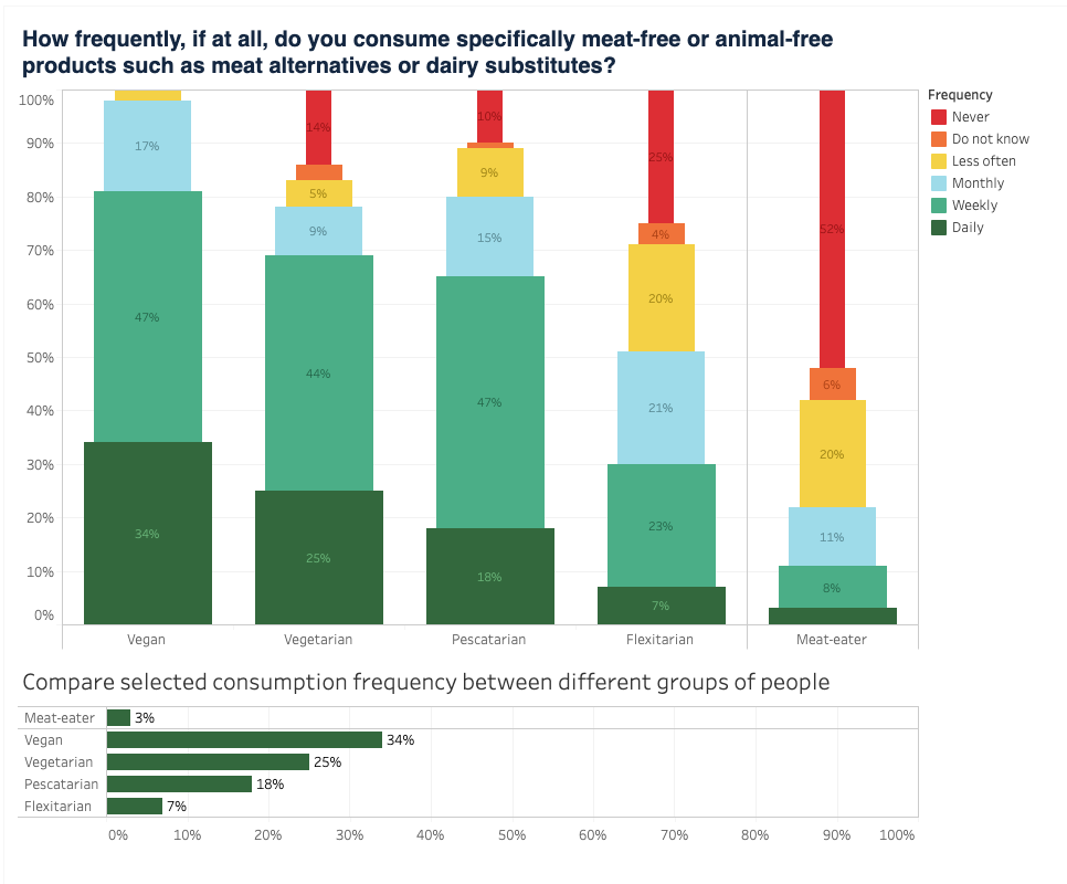
My reworked chart
I’ve published it on Tableau Public.
Experience
The main thing I wanted to emphasize in this chart is the time frequencies. In the original chart I did not see the clear distinction between the effort of consuming non-animal related products on a daily basis, and the full lack of this effort.
Other than that I wanted to put a clear distinction between meat-eaters and the ones that follow a specific diet.
Also I wanted to use the colors, size and the ordering to show the differences between the effort that the different people put in.
I set a color range from green to red. In my opinion red is a better color to show that someone Never consumes specifically meat-free/animal-free products, than the green color that the original chart uses.
I think someone that do not think about this might eat more of these products than someone, who loves meat and wouldn’t change it for any other substitution, so I put the never label on top, making it the smallest.
I did not like in the original image that the axis went over 100% without meaningful data. I let my bottom chart run to 100% to prevent unintentional axis changes.
When I did this challenge, I set myself a max 1.5 hour timeframe, so I did not have time to polish it until perfection. There are some things I miss, like bigger font on the barcharts, clearer font colors, explanation of size.
My favourite part is that on hovering any of the top bars, a plain english sentence tells me what I need to see, and the chart on the bottom updates with the appropriate data.
The overall result is a bit redundant, the reason behind that is that I wanted to take some time to practice some Tableau features.
All in all it was a nice experience putting my newfound knowledge in use.